
What is it?
Trade Cipher is a startup company that offers people in unstable economies a chance to save money in the cryptocurrency marketplace.
Problem
Trade Cipher was about to launch their product with one big problem. The app they built didn't work. Technically it worked, but users were abandoning their tasks mid screen.
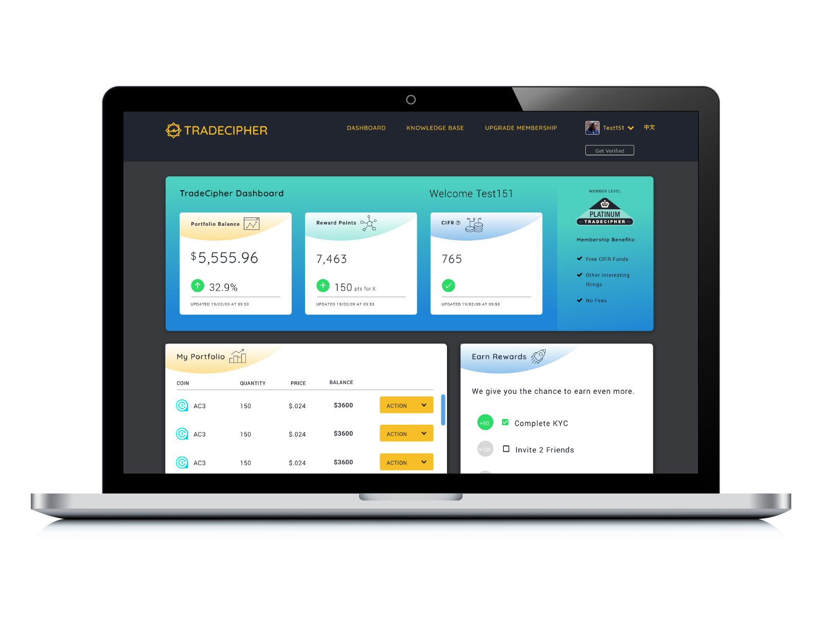
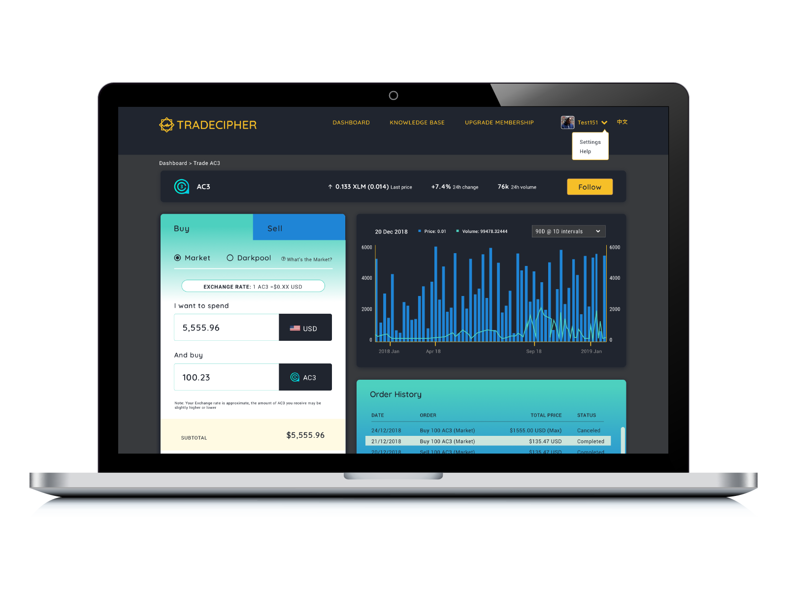
I was asked to improve the user interface/visual design and help them launch the MVP. I focused on two areas, the dashboard and trade module where users complete a cryptocurrency trade.
The reality is Trade Cipher was a startup with limited funds. What they wanted was all the bells and whistles. What they needed was an easy to use platform that actually worked.
Heuristic Evaluation
An initial audit of the site in development was eye-opening. We had several key issues; there was no clear path for users to complete their task, the navigation was ambiguous, and there was no visual hierarchy to the information presented.
Competitive Analysis
I looked at several direct and indirect competitors in the financial space. I wanted to learn more about the elements that made these companies exceptional:
• Each website assisted users with a concise navigation and helpful visual cues. (ex. Log In to Trade)
• Plenty of articles and help icons educated users to becoming smart investors and using their product.
• Simple, uncluttered UI made each user action meaningful in reaching their goal (money transfer/trade)

UX Goals
From the heuristics and competitive analysis my next steps were to:
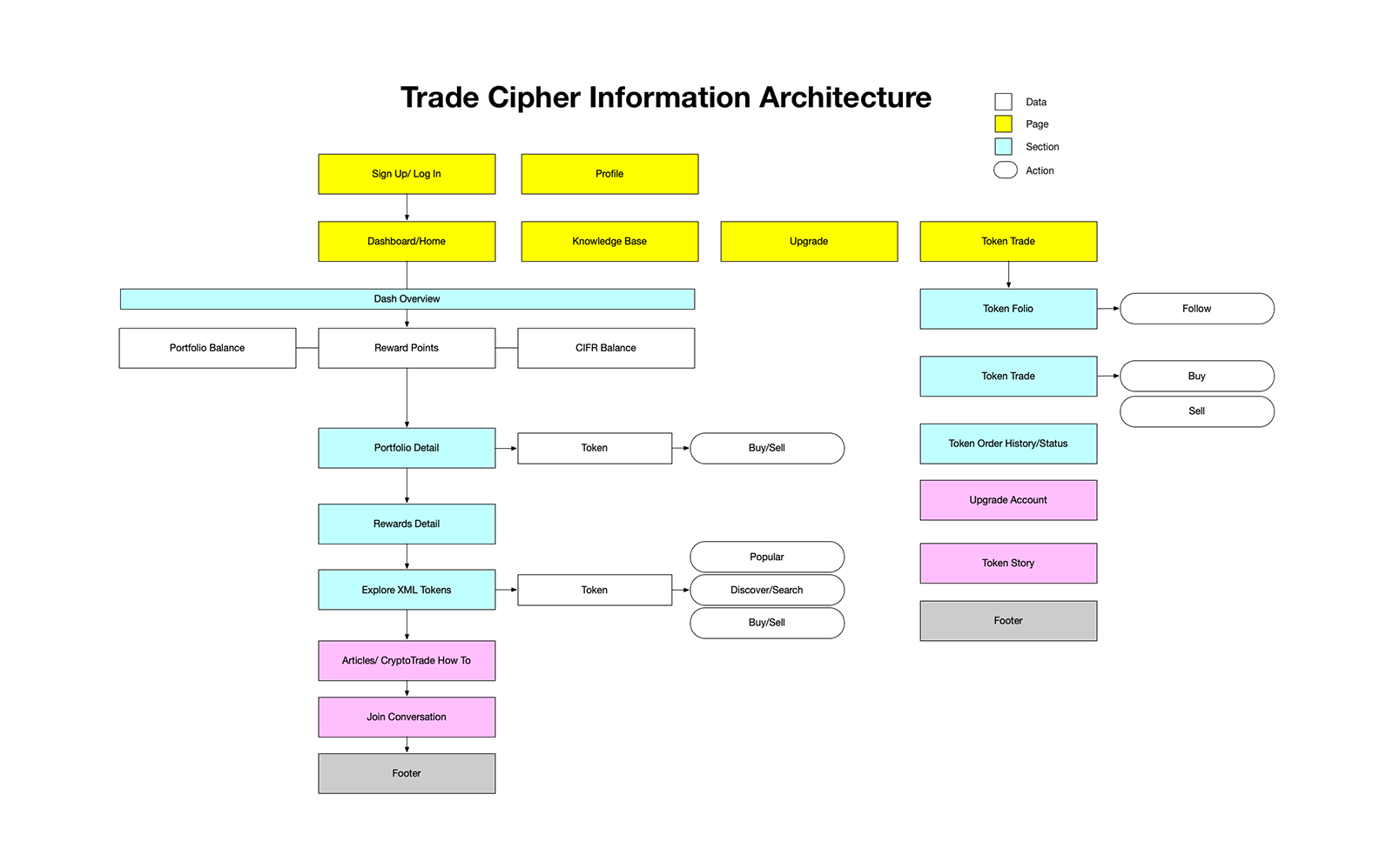
– Create a user flow, a clear path so customers could trade cryptocurrency easily.
– Build a UI based on the new trading user flow.
– Create a dynamic, inviting visual design that captivated users.
TradeCipher Mini Style Guide
Trade Cipher was focused on Millennial and Generation Z audiences. We went through several color combinations.

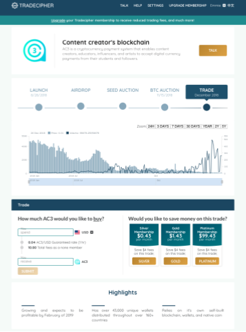
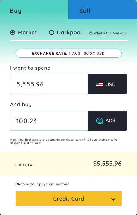
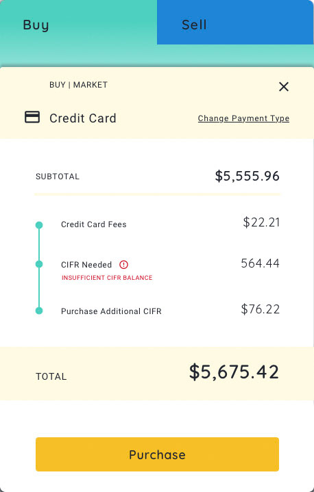
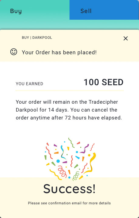
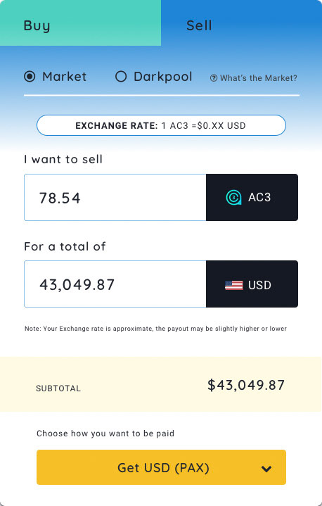
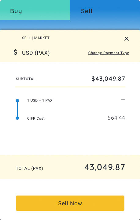
TradeCipher High Fidelity Trading
A high-fidelity trade mockup was built and iterated on after several stakeholder meets.


What I learned
I always say I’m a UX Designer that specializes in UI and Visual Design. When companies come to me they are already thinking about how the product should look. And that's great, to be competitive a product needs to shine!
Sometimes it’s good to take a step back. UX is a process. UI and great visuals are only a small part of that process. Who will use our digital product? Why will they use it? Startups need vetted ideas to succeed. What kind of content will support our user’s journey? How can we speed up their task and make it truly enjoyable.
The project was harder than it should have been. I lacked the initial research and was under a time crunch to make the visuals look great. Still I worked on a user flow, generated from stakeholder meetings, heuristics and best practices. There were also a lot of low hanging fruit (UI elements that I could easily fix) and I built something customers could love.
Positive user feedback and metrics reflected my hard work. While not perfect, (That’s why we iterate) we made a strong leap in the right direction!